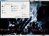
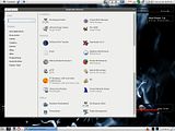
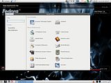
Here are some screenshots:

The Panel Applet

The Application Menu

The Control Center Menu
It runs quite well on Fedora with only the "Recently used application" list at the panel applet is not working. Some buttons are SuSE specific and require a manual editing of the schema to make it uses a fedora app ( fullo's RPM package from the link above already fixed this ). The interface are very much near Windows XP start menu with a little twist - applications are shown on a whole new window - very friendly to Linux newbies. The control center application reduces the confusion to Windows users who want to find where to change their systems settings because everything are gathered and arranged in a way that they are very similar to windows' control panel.
Overall i like the design very much because of the beauty and properly arranged icons thats confortable to the eyes. The default gnome-menu is quite closely arranged and having a lot of apps in one menu always brings confusion to me when searching for what app i want to run - making me running those apps from terminal (due to my laziness to look through the menu ). However, when it comes to speed, the default gnome-menu is much faster because you dont need to another application to load to show you where the menu it. Having both of them side-by-side is quite fun and usefull. :)


